

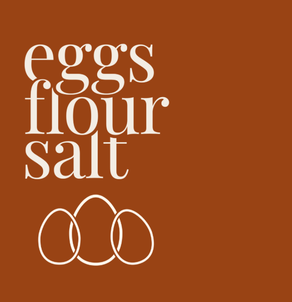
Eggs Flour Salt
ORIGINAL LOGO
Built from scratch.
Ready for its next chapter.
Eggs Flour Salt is a small-batch handmade pasta business based in Mornington, built around a beautifully simple philosophy: great pasta starts with great ingredients.
When Lily came to Jay.Creative, the business was at the beginning of its next chapter. With fresh handmade pasta, dried pasta shapes, sauces, pangrattato and parmesan on the horizon, the brand needed an identity that could feel distinctive on a market stall, considered on a shelf and memorable online.
The goal was to create something that felt handmade without being rustic, premium without being precious, and Italian-inspired without falling into cliché.

Lily wanted to establish a complete visual foundation for Eggs Flour Salt before launching the product range.
The brand needed to work across:
Fresh handmade pasta
Dried pasta
Sauces
Pangrattato
Parmesan
Farmers' markets
Packaging
Social media
E-commerce
Print collateral
Most importantly, the identity needed to be flexible enough to grow with the business rather than needing to be reinvented as new products were introduced.
The Challenge
The name Eggs Flour Salt already had a strong story behind it; three simple ingredients, used to create something people love.
The challenge was turning that simplicity into a visual identity that felt just as considered.
The brand needed to communicate craftsmanship and quality without relying on predictable pasta imagery, Italian flags or traditional trattoria styling.
Instead, the direction was to create a contemporary food brand with a strong sense of place, personality and recognition.
The Solution
Jay.Creative developed a complete visual identity centred around simplicity, craftsmanship and the three ingredients at the heart of the business.
The result is an earthy, editorial identity that allows the food to take centre stage while creating a recognisable visual world across every customer touchpoint.
The Brief:
Services Provided
Brand Strategy • Brand Identity • Brand Guidelines • Graphic Design • Social Media Support
The Brand Identity
The Eggs Flour Salt wordmark became the hero of the identity.
A distinctive, high-contrast serif treatment gives the name an editorial quality, while the stacked arrangement creates a strong visual block that works beautifully across packaging, signage and digital applications.
Rather than creating a literal pasta icon, the brand's supporting motif became three overlapping eggs.
Simple, distinctive and directly connected to the name, the motif gives Eggs Flour Salt a shorthand that can eventually become as recognisable as the wordmark itself.
It can be used independently across:
Packaging • stickers • deli paper • social media • signage • apparel • stamps • labels
Packaging System
The identity was designed from the beginning with packaging in mind.
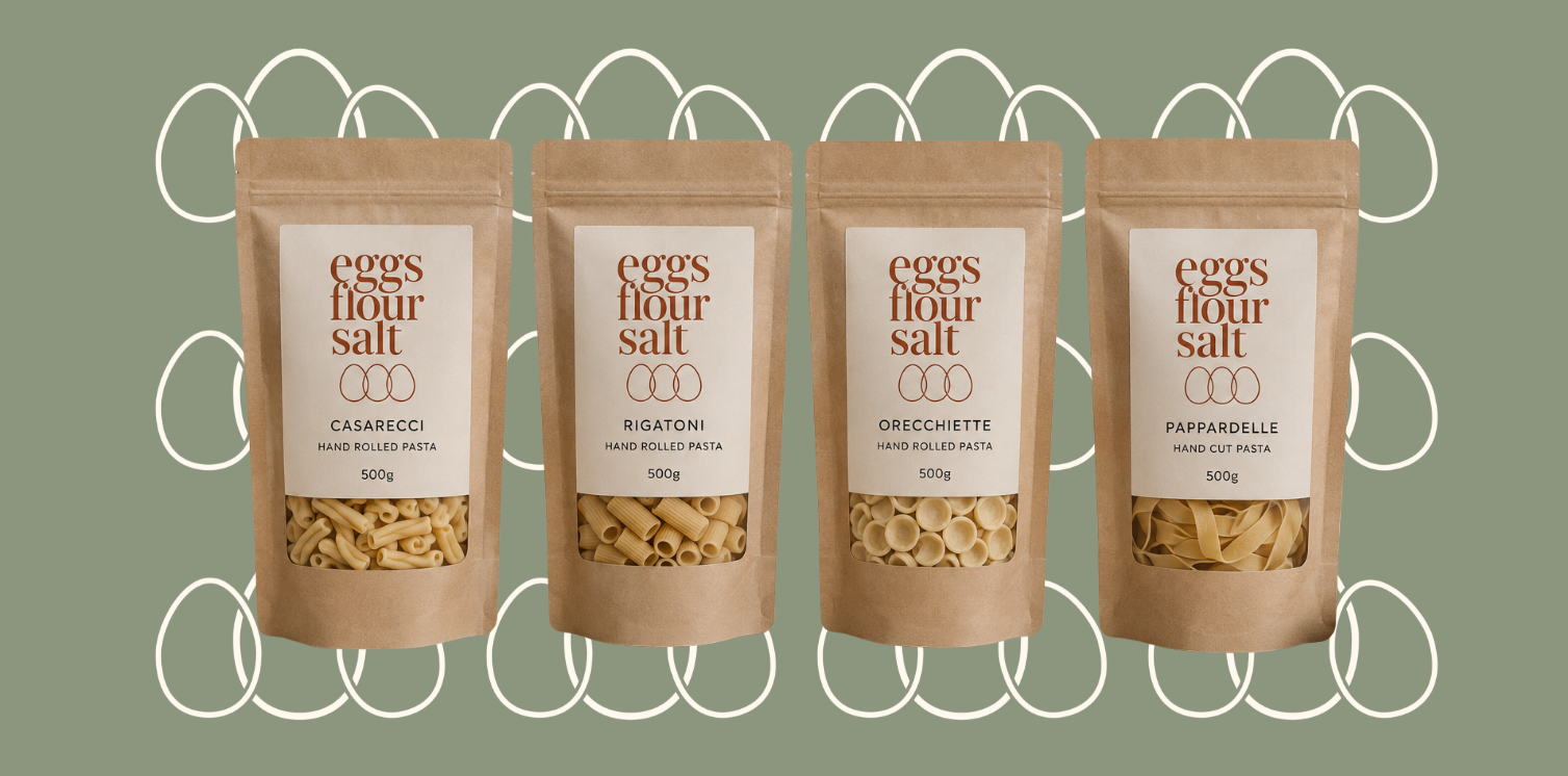
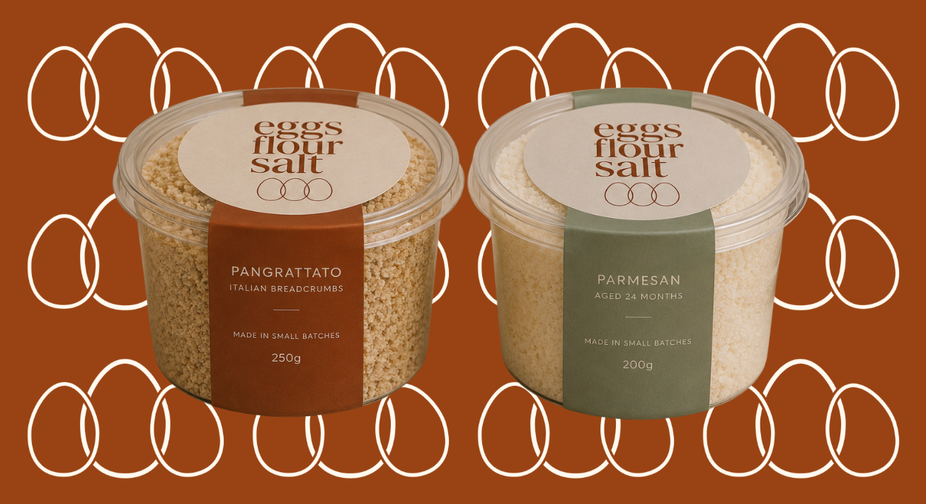
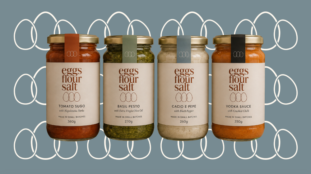
Rather than treating every product as a separate design, a cohesive packaging system was created so the range feels like one family.
The system extends across:
Fresh pasta boxes
Fresh pasta sleeves
Dried pasta packaging
Sauce jars
Pangrattato tubs
Parmesan tubs
The result is a product range that feels connected while still allowing individual products and flavours to have their own identity.
A Palette Inspired by the Ingredients
The colour palette was designed to feel earthy, warm and contemporary.
Terracotta became the signature brand colour, bringing warmth and appetite to the identity.
Sage introduces an organic, ingredient-led quality, while Slate provides a cooler contrast.
Charcoal anchors the brand and creates strong contrast, while Cream provides the soft, natural base across packaging and digital applications.
Together, the palette gives Eggs Flour Salt a distinctive presence without overwhelming the products themselves.
Farmers' Market Experience
Because Eggs Flour Salt is a local food business, the physical market experience was an important part of the brand.
The identity was translated into a market environment designed to feel warm, considered and inviting, rather than overly commercial.
The system incorporates:
Branded market signage
Table styling
Product displays & Price signage
Branded table textiles
Packaging
Staff apparel & Shopping bags
Deli paper
The goal was to create a stall that customers could recognise from across the market.
Deliverables
Brand Identity
Primary logo
Secondary logo applications
Signature three-egg motif
Colour palette
Typography direction
Brand styling
Tone of voice
Packaging
Fresh pasta packaging direction
Fresh pasta sleeve
Dried pasta packaging direction
Sauce jar labels
Pangrattato packaging
Parmesan packaging
Packaging system and hierarch
Digital
Instagram visual direction
Social media templates
Instagram profile styling
E-commerce/Shopify art direction
Market
Market stall creative direction
Signage
Product display direction
Staff apparel
Shopping bags
Deli paper
Brand Guidelines
Logo usage
Colour system
Typography
Motif usage
Photography direction
Tone of voice
Packaging direction
Social media direction
Brand application examples
The Outcome
Eggs Flour Salt now has a distinctive brand foundation built to grow with the business.
What began with three simple ingredients has become a complete visual language that can move seamlessly from a handmade pasta box to a farmers' market stall, from a sauce jar to Instagram and from a local Mornington business into a broader food brand.
Most importantly, the identity gives Lily a brand that feels recognisable, ownable and genuinely hers, while leaving plenty of room for Eggs Flour Salt to evolve.
Three simple ingredients.
One distinctive brand.
A whole lot of pasta to come.